
Streamlining E-Commerce: Yoga Design Lab
2022
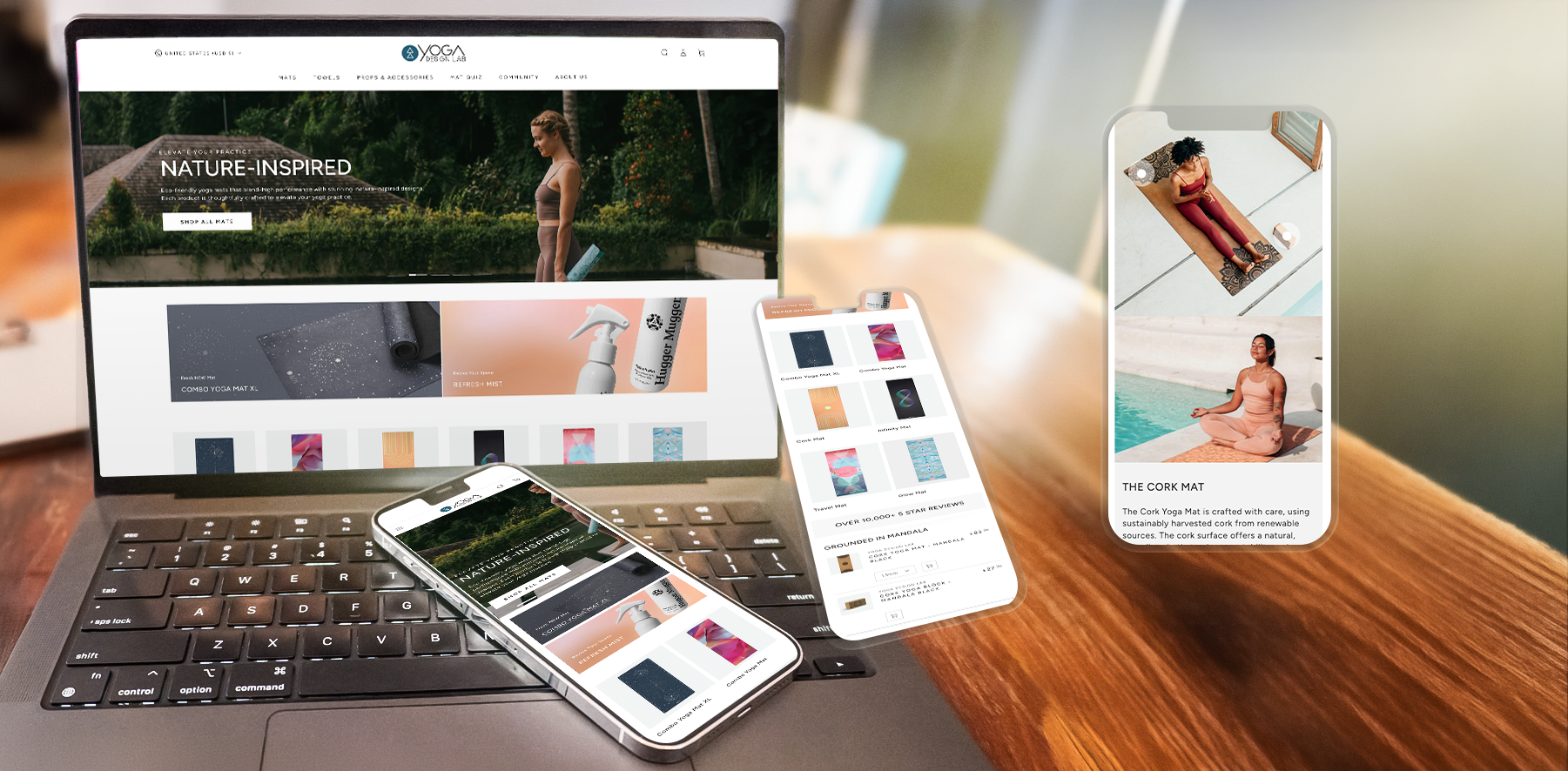
Transforming a fragmented, image-heavy browsing experience into a high-converting e-commerce engine. By combining external user research with a complete restructuring of the information architecture, I led the transition from a visual collage to a streamlined, intuitive shopping journey for yoga practitioners.
Strategy and Solution
As the Lead UX Designer, I was tasked with revamping an underperforming e-commerce website that was struggling to generate leads and sales. The existing experience felt more like a mood board than a functional store. While visually striking, it was a dense collage of images that lacked clear user guidance. Customers—primarily yogis looking to purchase specific equipment like mats and accessories—found it incredibly difficult to navigate, locate products,
I proposed a dual-track approach. First, I advocated for outsourcing a dedicated user research study to gather concrete, unbiased data on where the specific friction points lay.
While that study was underway, I wanted to maintain momentum. Drawing on my NN/g training, I conducted an expert heuristic evaluation to identify immediate areas for improvement.
We needed a complete restructuring of the information architecture and a much more intentional strategy regarding the visual balance of copy and imagery.
The primary goal was to transition the site from a cluttered image gallery into a guided, intuitive shopping experience. I championed a clean, minimalist design aesthetic that allowed the yoga products to take center stage without overwhelming the user.
The Results
The core objective was to transform the site from a cluttered, "Pinterest-style" mood board into a highly intentional, guided shopping journey. By shifting toward a cleaner, more minimalist layout, we were able to reduce cognitive load and put the focus back on the products.
Restructured Information Architecture: We completely overhauled the site’s navigation and content groupings. The new structure provides clear, intuitive pathways that guide practitioners directly to core product categories like mats and accessories.
Purposeful Visual Hierarchy: We eliminated the chaotic image collages, giving the layout room to breathe. I implemented a strict visual strategy where lifestyle imagery and product copy work together to guide the user's eye naturally down the page and toward primary calls-to-action (CTAs).
Frictionless E-Commerce Journey: The final design operates as an intuitive guide. Whether a user is browsing for inspiration or looking to quickly purchase a specific mat, the new experience supports their goals with a streamlined, user-focused interface.